Avatar
A versatile avatar component that displays user images, initials or a default icon with support for different sizes, shapes and status indicators.
Features
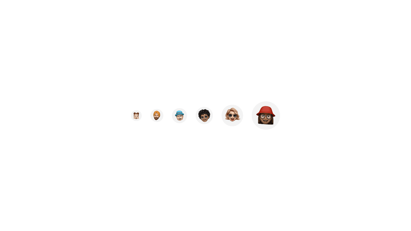
- Multiple sizes: xs, sm, md, lg, xl, 2xl, 3xl
- Square or circular shapes
- Fallback to initials or default icon
- Status indicators (active, away, sleep, pin, pinned)
- Image loading fallback handling
- Avatar grouping support
- Accessibility support
Installation
npx shadcn@latest add "https://frappe-ui-react.tmls.dev/registry/native-avatar"Usage
Basic Avatar
import { Avatar } from "@/components/ui/avatar";

export function AvatarDemo() {
return (
  <Avatar
    src={{ uri: "https://example.com/avatar.jpg" }}
    name="John Doe"
    size="xl"
  />
);
}
Avatar Sizes
import { Avatar } from "@/components/ui/avatar";

export function AvatarSizes() {
return (
  <>
    <Avatar name="John Doe" size="xs" />
    <Avatar name="John Doe" size="sm" />
    <Avatar name="John Doe" size="md" />
    <Avatar name="John Doe" size="lg" />
    <Avatar name="John Doe" size="xl" />
    <Avatar name="John Doe" size="2xl" />
    <Avatar name="John Doe" size="3xl" />
  </>
);
}
With Status
import { Avatar } from "@/components/ui/avatar";

export function AvatarWithStatus() {
return (
  <>
    <Avatar name="John Doe" status="active" />
    <Avatar name="Jane Smith" status="away" />
    <Avatar name="Bob Wilson" status="sleep" />
    <Avatar name="Alice Brown" status="pin" />
    <Avatar name="Charlie Davis" status="pinned" />
  </>
);
}